(Updated Nov. 8, 2018)
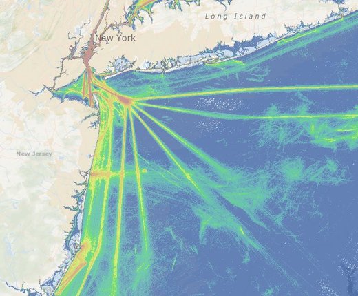
Learn where and when vessel traffic is most concentrated along the East Coast with 29 new maps in Marine Planner. The Portal’s collection of Automatic Identification System (AIS) maps, which previously covered 2011-13, has been updated with 2015-17 data, as well as layers displaying traffic for three new categories of vessels.
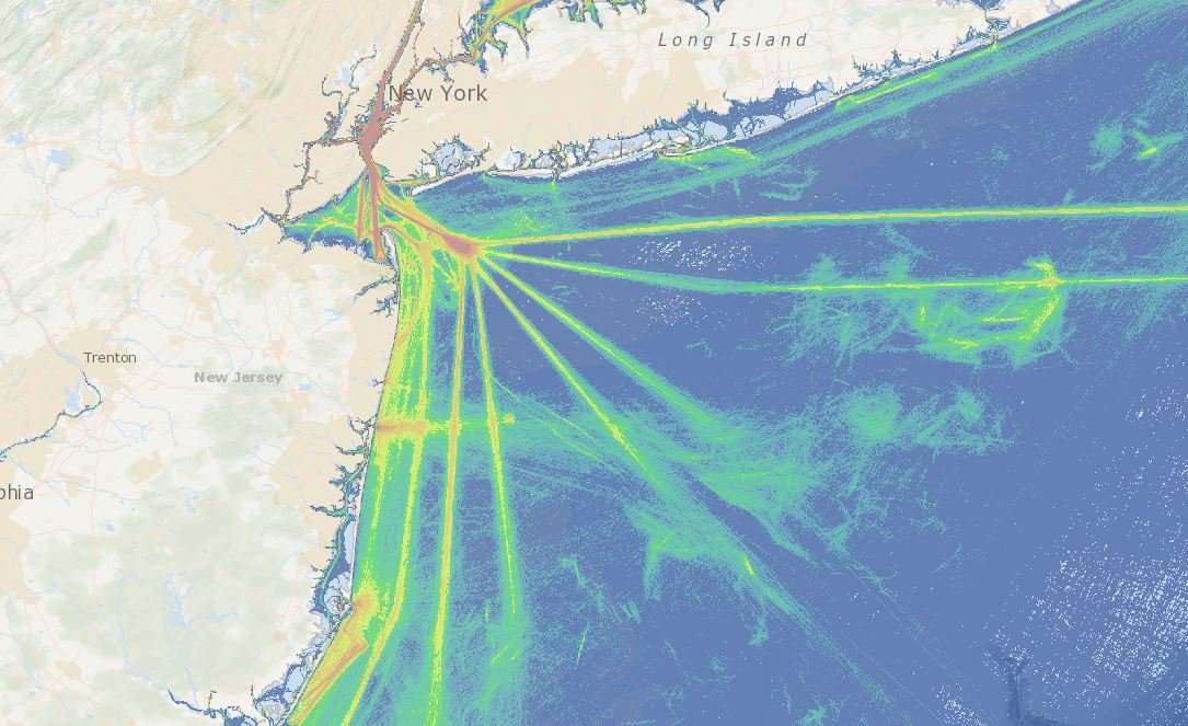
Since 2002, large vessels operating in U.S. waters have been required to carry AIS transponders, which send automated signals to nearby ships, onshore infrastructure and satellites indicating their identity, purpose, course and speed. Originally envisioned as a post-9/11 security measure, AIS data is now used by the public and private sectors for a far wider range of uses, including maritime safety, ocean planning, environmental protection and fishing fleet monitoring.
The latest data includes maps depicting all traffic for 2015, 2016 and 2017; maps that break out only cargo, passenger and tug/tow vessel traffic;
and for the first time, maps showing pleasure craft/sailing vessel, fishing and
“other” vessels. The latter category covers vessels that don’t fit within the
other groups, such as government-owned ships or research vessels maintained by NGOs
and universities.
Updated Methodology
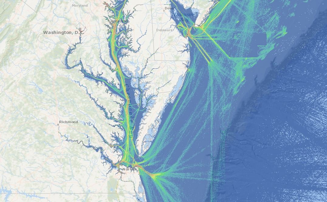
Reds, oranges and yellows in the maps indicate where vessel concentrations were highest, while cooler colors note where traffic was less intense. Specifically, the reds represent 100 meter grid cells where there were more than 500 transit counts while the darkest blues show areas with 10 or less.
This represents a change in the methodology used for the 2011, 2012 and 2013 maps, which displayed relative density rather than actual vessel transit counts. In practical terms, the earlier maps had different standards for each vessel category (e.g. passenger, cargo) that assigned colors based on how busy an area was compared to others in that category. Thus, a river could be colored orange as if it had intense tug-tow traffic when it only actually saw a few dozen vessels all year – a high number when compared to cells far out in the ocean, but not what mariners would consider heavy traffic.
In the new maps, all of the vessel categories use the same scale so users can make “apples to apples” comparisons. For consistency, we created new 2013 maps that represent actual counts. However, the original 2011, 2012 and 2013 density maps have been retained on the Portal for future use. All of the AIS map layers can be found in the Maritime theme in Marine Planner.
The vessel traffic datasets and interactive maps were developed in collaboration with partners from maritime industry, the U.S. Coast Guard, the Marine Cadastre, and the Northeast Regional Ocean Council. The maritime industry contributed valuable input at numerous presentations and briefings throughout the Northeast region, helping to guide how the data should be processed and presented to maximize their accuracy and usefulness. The data products underwent extensive expert review and were revised several times based on the reviews, with the change in methodology made due to feedback from stakeholders.
See the Maritime entry in the Portal’s Data Catalog for more information and download options.